Behind the design of Intercom on Starting Up


When we started work on our latest book, Intercom on Starting Up, we wanted to provide readers with a truly editorial experience.
A lot of “books” produced by startups are nothing more than a poorly formatted PDF, so we were keen to create something you would actually be proud to have on your bookshelf. Key to that was working with the Intercom Brand Studio to help bring the book to life. I sat down with Kelly Carpenter, lead designer on the book, to take us behind the scenes on the process.

Hey Kelly! We’d published a lot of digital books before but this book was a huge step up. Could you talk us through the process of designing a printed book?
Transitioning from digital to print was definitely a big jump for us as a team. We’re really proud of our digital books, but getting the chance to design something tangible, something you would be proud to have on your coffee table, really pushed us.
It also meant we had to ask ourselves completely different questions than if we were designing for a screen. What colors pop? Do we include special print techniques like debossing or spot varnish? Should it be hardcover or paperback? What type of binding should we use?
It was really important to us that we didn’t produce a “normal” book, with plain text and photos. Our whole mission at the Intercom Brand Studio is to try things a little weird, a little left of field, so we wanted to bring in some character through color and illustration. And because the book was all about Intercom’s journey over the past five years, bringing in some of that personality was key.

Had you worked in print before?
I had worked on smaller, one-off print jobs, but nothing close to the scale of a 120-page hardcover book. I focused heavily on print design in college. It was always so satisfying to see my designs in 3D. While I love the capabilities of digital tools and crazy techniques you can explore when working on web projects, I truly miss the smell of paper and the experience of reading a well designed book. And as a designer, it gives you a much more tactile way of connecting with people.
A lot of the design work at Intercom is web-based. It has its own constraints, but does print bring its own set of unique challenges?
One of the main challenges in print is lack of control. A lot can happen to a design during the journey from your pixel-perfect computer screen to paper. You have to find a printer you trust but even then there is a lot of room for unexpected things to happen. For example, I was working with Pantone swatches throughout the entire process that appeared extremely dull on my screen. But when these were printed they turned into these electric blues and fluorescent oranges. Your platform doesn’t change while working on web projects, which allows you to be a perfectionist. With print you are working from swatch books and paper samples, crossing your fingers it turns out right. The lack of control is pretty terrifying, but it makes it all the more satisfying when it works out well.
What other challenges did you run into? Apart from me changing copy all the time…
Ha! Other challenges included being under a tight deadline, proofreading for copy errors, packaging perfect files to please the printer and hitting the “approve proof” button. Also the production job of a printed book was much larger than I had anticipated but was fortunate to have awesome coworkers, willing to help me out with so many different design tasks – like creating inline images, illustrations and typesetting.
Talk me through these illustrations. What was the concept behind them?

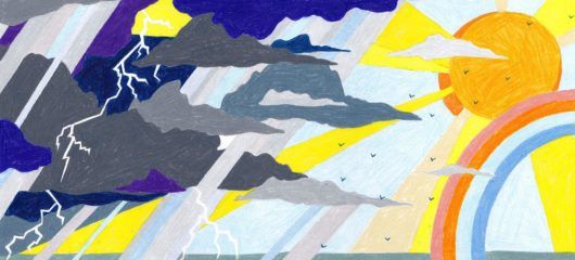
We needed organic surprises throughout the book to elevate the reader’s experience and decided to add fun illustrations that introduce each chapter by expressing the main idea (subject matter) of that chapter. There were nine chapter illustrations on our to-do list and tons of inline images to produce, which is quite a bit. This is where I give a shout out to my brand team buds for all their hard work and help to complete the visuals. Fortunately, this provided a refreshing variety of styles throughout the chapters.
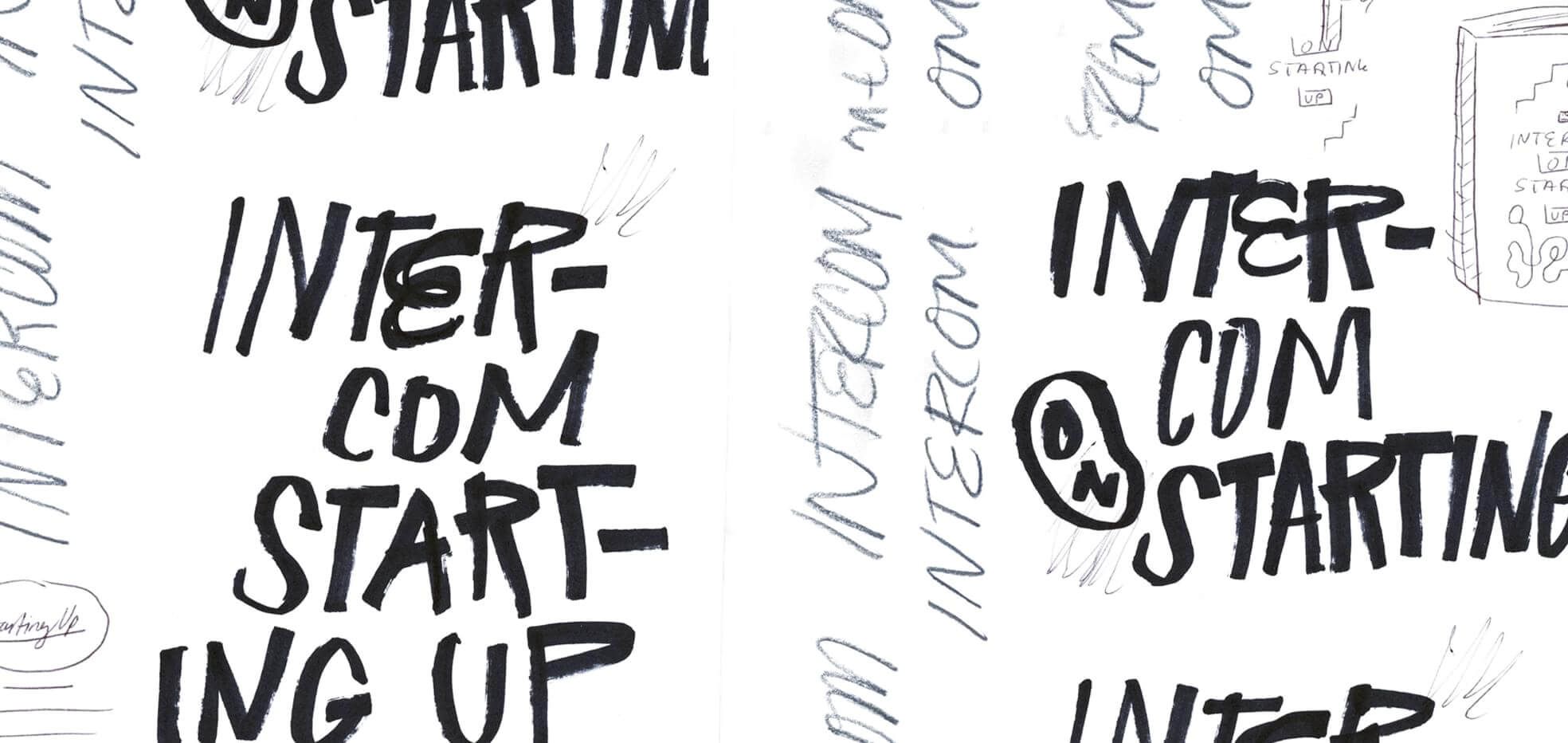
The typography really stood out for me. It struck me as something that was really used to leverage the book’s branding. What role does typography play in editorial design today?
I would say typography is one of the most important elements of any book’s identity. Choosing the right typeface was a decision we had to make early on. Type can carry so many subtle messages in terms of attitude. We wanted the book to feel sophisticated yet friendly. Ultimately we chose a combination of display and body typefaces that are familiar but at the same time carry the weight of what our authors are saying in a credible manner while still retaining some of the fun characteristics of the rest of the book.

Finally, how does working in print influence your other work?
The best thing about digital design is that your work can be totally limitless and full of freedom. But working in print means working within limitations. Having zero boundaries can seem exciting at first, yet it can often end up a mess of unfocused options with no clear direction. Without boundaries, I could easily experiment and tweak designs forever. Working within these boundaries has taught me that limitations and constraints are vital for success.